Y-Fitness
Y-Fitness, a fitness centre offering various exercise programs such as Kickboxing, Yoga, and Zumba for its youth members of age 18 to 30.
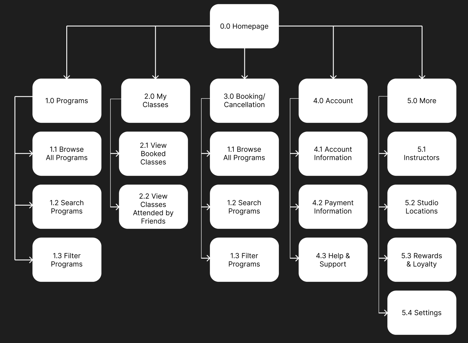
The sitemap was the foundational step, defining the structure and hierarchy of the application. The goal was to ensure all core user tasks: browsing programs, managing bookings, and checking personal progress—were no more than two taps away from the central navigation!
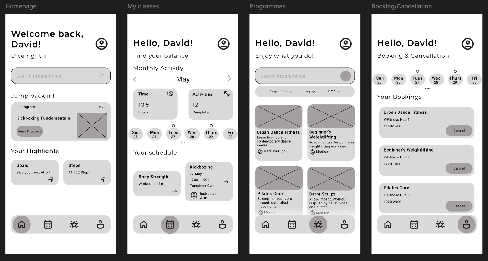
GoalThe wireframes helped me a lot in establishing the layout, content priority, and functional flow across the key screens. These were kept monochrome and low-fidelity to focus purely on usability and interaction before introducing visual design elements.
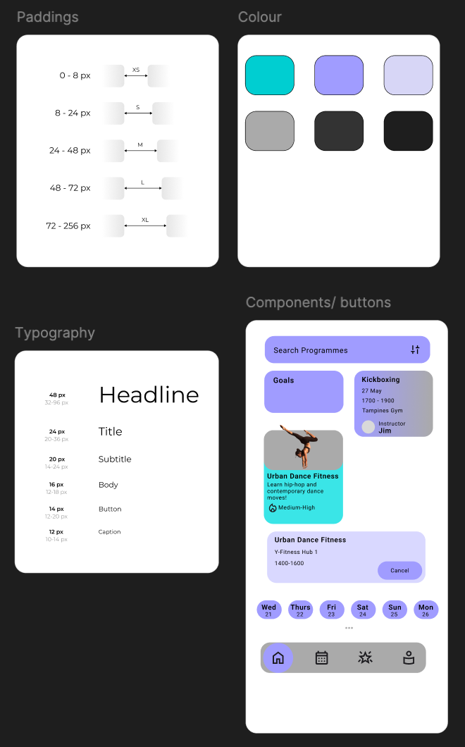
The style guide defines the visual language of the Y-Fitness app, ensuring a cohesive and engaging user experience across all platforms. The aesthetic was designed to feel energetic, modern, and reliable, hence the colours!
- Colour Palette: Utilizes a bright Teal \and a calming Lavender, contrasted with a dark background, to help promote accessibility and visual pop.
- Typography: A clear hierarchy is established with sizes ranging from 48px (Headline) down to 12px (Caption), ensuring optimal readability. Plus, I used a sanserif font to provide a more modern look too.
- Paddings: A clear, scalable padding system (XS to XL) based on 8px increments ensures consistent spacing and rhythm, making layouts predictable and scannable.
Final Mockup
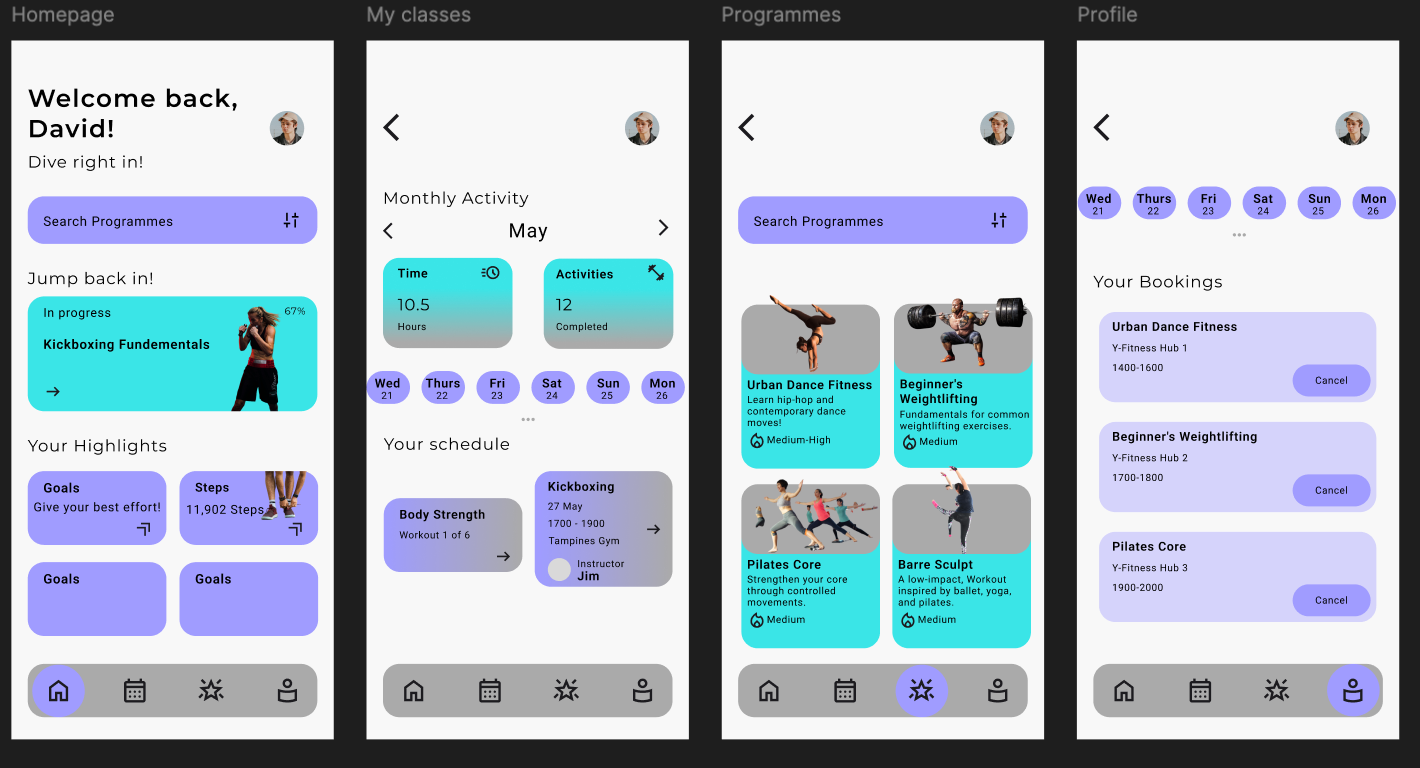
Enhanced ScanInability: I applied the dark background and bright foreground elements to clearly segment content, allowing users to scan for relevant information quickly.